Screenshots could be different: evocative or neutral, vivid or inconspicuous. The key thing about them is that they are to invite the audience’s attention. It is an effective tool to win clients and encourage them to become your loyal users. Great screenshots will easily handle that task.
Today we shall figure out what it is all about.
Page Contents
Why should one design screenshots?
Speaking of a long-term perspective, the very first impression is extremely important. In fact, that is what actually matters. A bright picture is to call the attention making people click to download the application.
Cold statistics prove that properly created app store images are able to increase the conversion rate by 19%, which is a huge thing! So, it’s time to reveal all secrets on how to make amazing screenshots.
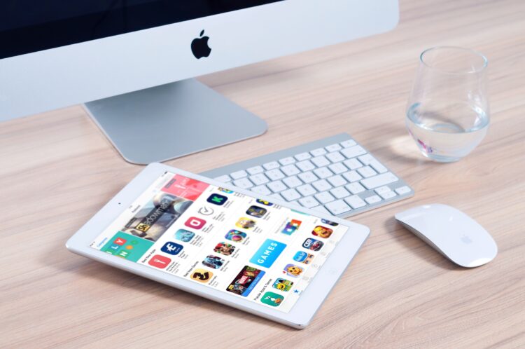
#1. Carefully examine screenshot guidelines of App Store and Google Play

Source: pexels.com
No need to worry since you won’t have to reinvent anything while building screenshots. Apple & Google are happy to offer you extensive recommendations. Aren’t really sure what to start with? Simply take their clear advice.
Even so, make sure you add some personal touch and stay creative. Those platforms are just offering their recommendations, and not ordering. For instance, Google Play allows 8 images, while the App Store accepts up to 10 screenshots. Still, you don’t have to make all 8/10 of them.
In the majority of cases, 40% of app owners decide to have only 5 pieces, and that number turns out to be quite enough. Just stay flexible.
#2. Decide what format shall perfectly fit your platform
In broad terms, you have two positionings to choose from: vertical and horizontal, and there are considered to be classical formats for all screenshots.
Multiple factors – like, the type of the service in question – shall be taken into account in order to select the most suitable option. For example, landscape orientation will better work for games and other similar solutions.
Numbers show that when dealing with Apple screenshots, over 90% of developers perfer vertical format. Regarding Google Play images, horizontal orientation is chosen in about 45% of cases, so both positionings are quite sought after here.
One more thing to remember about. If you want to create an excellent screenshot, bear in mind that it might make more sense to go for horizontal orientation to ensure proper readability in app store searches. Such an approach would perfectly emphasize your call to action. You could learn more about UX design to get a better understanding of that process.
As for the size of screenshots, while creating those images you need to consider various screen resolutions. Google Play will only ask for the maximum and the minimum sizes of pieces, whereas Apple demands more time and effort since it requires a separate screenshot for each existing size of screens iOS gadgets have.
#3. Don’t forget about the text

Source: fiverr.com
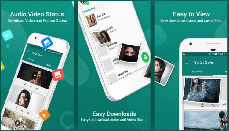
It might happen that people with a lack of experience won’t figure out what a picture shows, and what problems a particular program is designed to solve. That would be the case of applications having original functionalities. Thus, it would be a great idea to supplement an image with specific text messages.
As you understand, that text has to clearly describe the key characteristics of your online product, and there must be no ambiguity. The correctly chosen background will make your phrases more readable.
The formula to go for is the following:
Nice Pictures + Convincing Message = Great Screenshots
You might want to check a few examples to get a clear understanding of what we’re talking about, thus, you could take a look at the Skyscanner’s screenshots. Its owners have decided to present several images to tell the audience a story about traveling and dreaming. Such a creative approach inspires users clicking and downloading the solution.
#4. Show the rewards you have received
In case you own certain rewards for your achievements, it’s the right moment to present them to your potential clients.
For instance, you could add some positive reviews of celebrities regarding your brainchild. Or, maybe, you’ve got the won rating. Those could be any of your accomplishments.
#5. Apply localization to your advantage

Source: wordbee.com
The localization of the software page represents a valuable tool to use for good. In case your app is planned to operate in multiple countries, the mentioned feature shall translate text messages in the pictures.
Moreover, localization helps with designing screenshots to match the culture and traditions of a specified country.
#6. Your competitors are out there
Every market has its competitors, so there are no ways to escape from them. For this reason, it could be a smart idea to take advantage of their experience. We’re talking about exploring how the owners of various popular platforms build their Apple/Google Store presentations.
After having found out what the rivals’ screenshots are, you could pursue one of these strategies:
Act in the opposite direction. The idea is to surprise the audience with extraordinary and unexpected screenshots to differ from the competitors’ images.
Upgrade what you see. There are situations when the best approach is to take the concept your rivals have and enhance it, maybe, by supplementing a particular appeal.
In case you’re hesitating about what strategy to apply, your development team could advise you on the best design solution.
#7. Figure out what order of screenshots would be the most effective

Source: instamocks.com
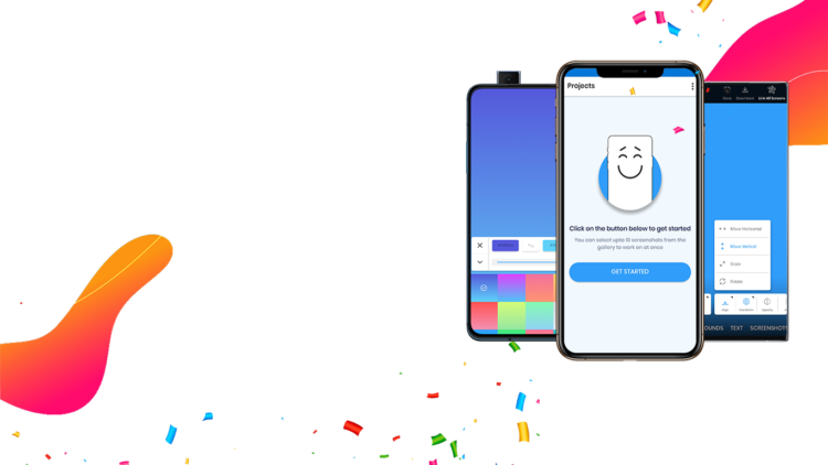
The key idea of every screenshot is to help users decide whether or not they need to download a service in question. That is the reason why the very first picture must be truly appealing and informative. It has to be created to call the attention of people.
Regarding other images, they could tell the audience a compelling story.
For instance, WhatsApp uses the first screenshot to illustrate its key functionality – the possibility to securely and conveniently message in realtime. In fact, descriptive texts are complementing its every picture.
Summing up
It’s vital to remember that the way your program appears on Google Play/App Store, will significantly affect users’ decision to take advantage of it (or not). The sequence of your screenshots has to be logical, persuasive, telling a nice story, talking to people in their language. Moreover, an online product shall be great as well, otherwise, even having built perfect screenshots will not help its owners achieve the results expected.


